How to select a good colour map for visualising data
There’s more to it than just making a plot look nice
Visualisations are meant to be effective tools for communication
Visualisations are a great tool for understanding data and communicating useful information. By using colour, we can improve the interpretability and information density of our plots. However, some of the most popular colour maps are difficult to interpret correctly and are terribly misleading.
A poor choice in colour map for plotting numerical data can hide important features and also lead us to believe in features and structure in the data that do not exist. How we choose to colour our plots and images is not a trivial issue. Poorly selected colour maps have been known to raise error rates in medical diagnoses and have no doubt lead to many erroneous scientific and business endeavours.
In this post, we will demonstrate how misleading some of the most popular colour maps can be and suggest alternatives for presenting numerical data. We will look at colour palettes for categorical data in a future post.
A humble note: I am not an expert on colour, our eyes, vision, or perception. Some of the details or terminology I use below may be wrong. I do however know a thing or two about data and building effective visualisations.
What makes a good colour map?
According to people who understand these things, a good colour map for numerical data should be:
- Colourful. A variety of colours improves contrast and helps us identify changes in the data.
- Perceptually uniform.
- Values in the data that are close to each other should be represented by colours that we perceive to be similar to each other.
- Values far away from each other should be represented by colours that we perceive as being different from each other.
- How we perceive the changes of colour and how it represents changes in the data should be consistent across the colour map.
- Robust to colour blindness. The colourmap should still reliably interpretable by those with colour blindness.
- Interpretable in black and white. People still print out documents to read and take notes on.
And hopefully
- Intuitive. For example, warner colours for ‘hot’, cooler colours for ‘cold’.
- Easy on the eyes. Some colours can cause discomfort if stared at on bright monitors over long periods of time.
- Aesthetically pleasing. A bonus.
Some examples of good and bad colour maps
The plot below shows two of the most popular colour maps for representing numerical data.
 Looking at these gradients independently, do you think you could guess what values the colours represent?
- Looking at the Rainbow gradient, it appears that there must be a flat spot or plateau in the green and blue sections of the data, and steep changes at the red/green and green/blue borders.
- If we look at the Jet gradient, it looks like there must be a flat spot in the blue and red sections with steep changes at the blue/teal and yellow/orange borders.
- Given these observations, surely it would be crazy to think these two images represent the same data?
The data behind both of those plots is a perfectly linear sequence of values from 0 to 1, so the fact that these two palettes appear to show some form of nonlinear structure and at different locations should be concerning. Whatever structure we see in the above plots is not in the raw data, but in how our brain and eyes interpret the different colours in the colour map.
The plot below shows the underlying data, and how it is represented in three other colour maps.
 Viridis is a colour map that was designed to satisfy the requirements laid out in the previous section. Like the greyscale gradient applied to the same data, we observe that it is perceptually uniform, and we are not fooled into believing there is any special structure or features in the data. Turbo is a colour map designed by Google to overcome some of the drawbacks of Jet. It is a smooth, colourful, high-contrast colour map that allows for subtle changes in the data to be seen more easily. However, the use of many colours and the shape of its perceived lightness profile (plotted below) can make it difficult to accurately communicate the shape or distribution of the underlying data (more examples below). The lightness profiles for Rainbow and Jet are also given, partially explaining how the perceived structure we observe in the smooth, linear data is due to the colour map.

A real-world example of a poor colour map
Below is a screenshot of the rain radar from Australia’s Bureau of Meteorology mobile app.
 This colour map is not perceptually uniform, the changes in colour between sequential pairs of the colour buckets vary dramatically. This colour map makes it appear as though there are areas where there are sharp changes in rainfall intensity between dark cyan and yellow regions, but also small variations between light cyan and dark cyan regions, however, this is not the case based on values in the legend.
Additionally, using a discrete colour map is an odd choice for rainfall intensity which is a continuous variable.
Let’s add some interesting structure
What happens if we introduce some discontinuities into the data? Below are some cherry-picked examples of situations where rainbow style palettes hide features in the data instead of manufacturing them.
Linear discontinuity
For the data in the figure below, we’ve introduced some small discontinuities at around 
An even more cherry-picked example
The next example shows a situation where the maximum values in the data are next to the minimum values in the data, this is a significant feature in the data, but again imperceptible in the rainbow map. This example also demonstrates how the higher contrast of colourful maps can make it easier to distinguish between large but smooth changes in values. In this example, the greyscale makes it difficult to see even large changes in the data (
A Gaussian
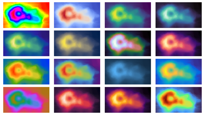
The next example is slightly less trivial, and more likely to pop up in a statisticians or data-scientists work: a simple multivariate Gaussian.
 Again, we see the two popular rainbow style maps communicating a sense of structure to the data that does not exist. Without knowing these images were of a Gaussian, you might think the data was a series of rings with some smooth and sharp edges between them. Below we see the same data plotted with Viridis and Turbo maps. Viridis represents the data well, with a smooth gradient with no plateaus from the low values to the extreme values in the centre. Turbo, whilst smooth and not generating the illusion of false discontinuities, does not give a good sense of the distribution of the data. The bright outer ring could convince the viewer the values of the data are much larger than they actually are.

A broken Gaussian
The next plot shows a Gaussian with some discontinuities in it, plotted with the same colour maps as the previous examples.
 As with the linear case, the rainbow maps completely hide the discontinuities in the data whilst suggesting there are other discontinuities that are not present. Again, Viridis performs very well, with the discontinuities being present, and smooth gradients between them. The discontinuities are visible with the Turbo palette, but due to the range of colours present, we get less of a sense of how big the discontinuities are.
Sequential and diverging colour maps
The examples we’ve looked at above are good fits for sequential colour maps where we are plotting values on a continuum with no baseline state or reference value. If we want to plot deviations from a reference value, a diverging colour map might be appropriate. For example, the sequential Viridis or Inferno maps would be appropriate for plotting current precipitation or temperatures around the globe, but warmcool or ocean.balance might be appropriate for plotting the differential or anomalies in temperatures relative to a long-term average.

Below are examples of some preferred sequential colour maps
 And here are some useful diverging colour maps

Recommendations
If you’re plotting numerical data, whether it be a choropleth, a density, tile or hex plot, height/depth maps etc, consider whether the colour map you have chosen is accurately representing your data.
- Avoid rainbow style colour maps. They can hide important features in the data and manufacture ones that don’t exist.
- Understand wether or not a divergent colour map would be helpful.
- If a sequential map is appropriate, use Viridis or another similarly well-designed colour map. Good maps are available for the popular R and Python plotting libraries.
- Use diverging colour maps only if there is a very clear reference value from which to highlight positive and negative deviations.
- If you need a high contrast colour map that allows you to differentiate between many different levels, consider the Turbo map.
- Consider how the map might appear to colour-blind people and when printed in black and white.
More
If you are interested in colour maps, how they are created, or how to test them for different properties (such as how they appear to those with colour-blindness) check out the links below:
- viridis package for R.
- pals package for R.
- A great presentation by the creators of the Viridis colour map, Nathaniel Smith and Stéfan van der Walt.
- Another great presentation on the design and selection of colour maps, Kristen Thyng.
- A description of the Turbo colour map, Google AI.
- Good Colour Maps: How to Design Them, Peter Kovesi.
- No more rainbows! Matt Hall.